
Thursday, July 10, 2014
Tuesday, July 1, 2014
What do all the codes mean?
Lesson 2
Cracking the codes.
If you’re new to TerraPop/Ipums, or if you want to refresh your memory, go visit the first lesson, HERE or in a blog, HERE.
So far we’ve seen some basic IPUMS-USA/TerraPop Data, and used it to create graphs, and Identify trends. We’ve learned some key vocabulary, and hopefully have a basic concept of how to move around in the CODAP environment.
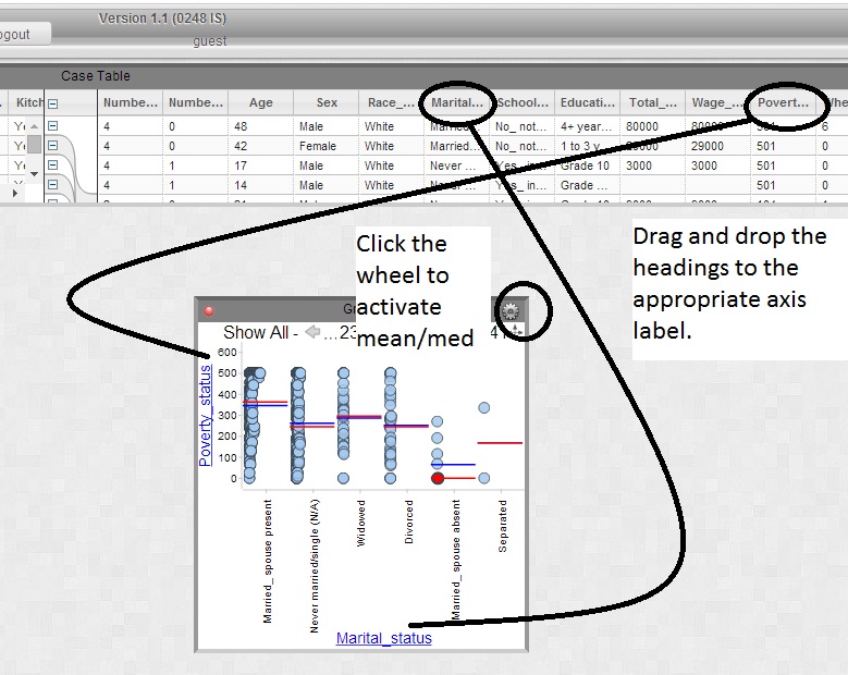
 Start by opening the IPUMS tutorial in the CODAP environment. Click HERE to do that. For this exercise, put Marital_status in the x-axis label, and Poverty_status in the y-axis label. Click the wheel, and turn on mean, and median.
OK, we have a poverty status, and a marital status. What do these codes mean? Marital status seems fairly straightforward, but what does poverty status mean? Let’s look at both. First, go to the IPUMS-USA site. There you can click variables or select data…

We’re looking for Marital_status so first click ‘M’. Then read all the variable labels until we find one we like. MARST is MARITAL STATUS. 
So Click it. Read the description. The comparability. The Universe. The codes.
Description is just that. What are we looking at here. In this case, marital status is relatively clear. But in clicking on comparison we learn that from year to year some terms change. Click on ‘universe.’ How many years of data do we have on ‘marital status?’ Almost 200 years worth of survey data!
But let’s not get overwhelmed by the data. Go back to our CODAP window. Let’s just take a look. What year’s data are we looking at? ONLY 2000. So we’re looking at a sample of Minnesotans, and their married status, in the year 2000. Make sure you read all the codes.
OK, Marital status is pretty normal, married, single, married but spouse absent, widowed. But what about ‘Poverty.’ What do those numbers mean.
Well, follow the above steps to find out what the Poverty level variable means. Again, start at IPUMS-USA. Read about the description, the characteristics, and the codes. Wow quite a bit there. Here is the basic summary. For poverty you get a number between 0 and 501. 100 means you are ‘at the poverty line.’ You are 100% of the poverty line. Any number below 100, and you are in poverty. The higher the number the better off you are.
OK, let’s go back to our CODAP Data. If you can’t find that window, it’s login as guest HERE, create a graph with marital status in the x-axis, poverty status in the y-axis, and click the wheel to turn on mean, and median.
Discussion questions:
What Marital status has the HIGHEST (best) poverty status?
What Marital status has the LOWEST (worst) poverty status?
Which is higher, Widowed, or never married/single?
Discuss these answers. Do any of them surprise you? What are some reasons why Married_spouse absent might have such poverty?
OK one last thing? Why do you think married_spouse present is better off than Never married/single? Does being married make you have more money? Hmm. Try this. On this same graph, drag and drop AGE into the middle. It’s the same graph, it’s just now going to show how old everyone is…

In addition to the different poverty levels, look at the purple slider at the bottom, and the color of the purple dots. What trend can we observe about AGE and POVERTY status from this?
This is a lot of information. If you had to summarize, take one lesson, what is a really undesirable status to be in as far as possibly leading to poverty?
Monday, June 30, 2014
Codap Lesson Plan Template, IPUMS USA
CODAP Lesson Plan.
Today we’re exploring data using the CODAP (Common Online Data Analysis Platform). CODAP is a software platform to help students work with data in any subject area. The tool will let you gain skills in interpreting data, searching for patterns, and using this knowledge to gain insight and understanding about a variety of real world issues.
CODAP’s powerful tools are designed to allow a student the ability to analyze a variety of data types or collections. Today, we’re using this scientific tool to understand SOCIAL questions in a way that is hopefully new, and and instructive.
Specifically, we’re going to be working with IPUMS data. Follow the link, find out what IPUMS is. You can go to this link to get a bit more detailed explanation of what IPUMS-USA Is.
So we’re looking at very specific type of data here-- Microdata. We’re looking at specific households and families and people in this system. If it all seems a little like the MATRIX, well, know that there are no names attached, and that this is a random sample of people. So, anonymity is protected. We’re just using the tool to find out about specific trends or patterns in the world around us.
Let’s get started navigating around the IPUMS-USA data.
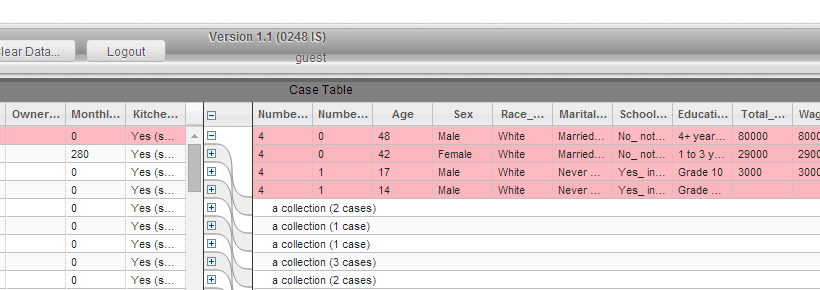
Find the word ‘CASE TABLE.’ Note that there are actually two tables here. Let’s explore them.
 |
| Note that there are two tables, one on the left, and one on the right. |
Mouse over the various column headings starting on the left, and working your way across. The full text will appear for each one. Move the mouse across and read all the headings.
 |
| When you mouse over the column headers, you can read their full content. |
.
Looking just at the left side, what do we learn from the table? What are we looking at?
OK, let’s explore our ‘MICRODATA.’ It’s simplest to start with the microdata collapsed. If your screen looks like THIS, great. If not, click the top most “-” symbol. It will collapse ALL of the data.

Now click ‘one’ of the “+” signs. What do you think we’re looking at now, in the highlighted information on the right?
 |
| Now we are looking in detail at the micro data for ONE household. |
You’re looking at ONE household there, chosen at random. What state are all these people from? What are some things we can learn about EACH person in the household?
So, on the left, we have information about each household. Total household income, what state, etc. And on the right, we have information about EACH person in the household. Pretty cool right? We have in our hands a powerful tool to find out about all of these households.
Let’s dive in.
We’re going to move on to making graphs. Hopefully we’ll find out some interesting information about the people of a certain state, in a certain year. Remember, this is a random sample. So the patterns we see should give us an accurate picture for the entire state of Minnesota. Later we’ll be learning to use the powerful tools of IPUMS (terrapop) to come up with our OWN questions for research.
Let’s dive in and start making some graphs. With simple drag and drop tools, CODAP will let us discover some clear trends.
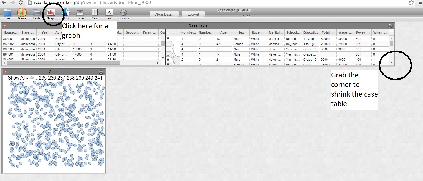
Shrink the ‘Case Table’ by grabbing the lower right hand corner and making it smaller. Then click the graph button on the top bar to create a graph. You’ll get something that looks like THIS:
All of those blue dots are our people. Let’s organize them. Grab the words ‘Age of Structure’ from the case table, and drag it down to our unorganized table. Yellow boxes will appear on the left, and right. Drag the age of structure to the bottom yellow bar.
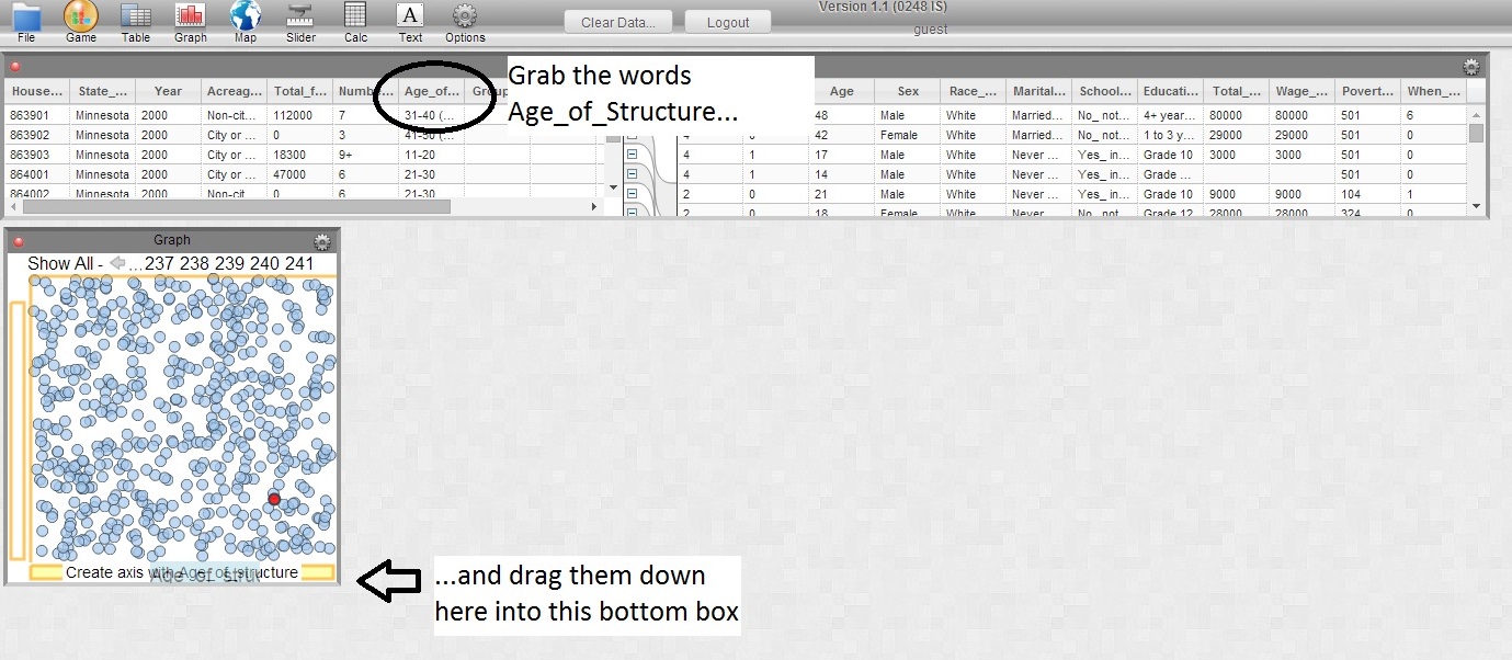
You will get something like this…

What do we have here. The Age of the structure (the house) has been sorted by how old it is. Sort of interesting. But, because the data is only as clear, or as useful as the question that was asked, we get a little confusion here. Is it clear to you what we mean by “31-40 (31+ in 1960_1970)? This doesn’t mean this is BAD information. And there might be sources to help us translate this information into clear language (there are). But let’s erase this graph, and pick out something that is a little more crystal clear. Click the small red button on the graph to delete it, and make another blank graph. OR, click (left click) the blue words ‘age of structure’ and select, “Remove X: Age_of_Structure”
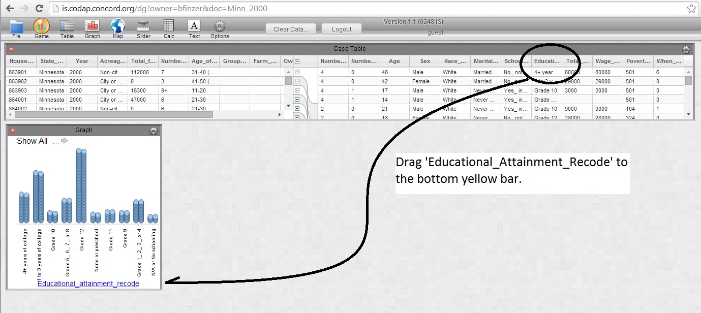
Alright, let’s try this. Drag ‘Educational Attainment’ to the bottom yellow bar.
OK. We have a bunch of different categories. These are the highest grade level achieved for our random sample of households, and the people that live in them. What is the most FREQUENT level of educational attainment?
Next, let’s but another variable on the Y axis on the left. Drag and Drop “Total_Personal_Income” to the y-axis (on the left). Cool huh?
OK what is this graph now telling us?

Every person in our sample is a blue dot. Every person has an income, and a highest grade they finished. OK put the mouse on top of the highest personal income dot. Their income will be shown. What is the highest personal income of all the people in our sample? What is their highest level of educational attainment?
Do you think that this is an accurate representation of the value of education?
One more thing before we move on. One of the most important things in using data is communicating what the data is telling us. For instance, if I asked you to write down a TITLE for this graph, “Total personal income associated with highest level of educational attainment” would be a solid example. Now let’s dig a little deeper with some more of the tools of codap, and see what else we can learn.
Is it more accurate to know what ONE person’s income was? Or what the income is for a group of people? The wheel icon in the top right corner of our graph introduces us to a few more tools. Clicking on it, we’re going to add the MEDIAN and the MEAN. These will be represented as a red line, for median, and a blue line, for mean. When you mouse over the line, the value in question will appear. Hint: If you enlarge the window, you can see it all a little better.

Questions for consideration?
Without mousing over and getting the specific dollar amount, are you surprised about how close the grade 12 and 4+ years of college are? How about after you mouse over.
Why is the ‘Mean’ so inflated for grade 12?
Read about the term outlier. Do you see any potential outliers in our data set? How do they affect means, and medians?
Could you tell me a trend you note about educational attainment and total personal income?
Could age affect your income? How much money would you expect an 8 year old to make? Drag ‘AGE’ and place it where ‘Educational Attainment’ is? About what is the youngest age shown? Note that it excludes the very young. But, do consider when looking at data the many questions raised. Some young students are still in school, therefore they haven’t reached their full earning potential. But in general, does it seem like college can help your earnings?
OK, let’s look at a couple other features of CODAP that can help us analyze data.
Either delete your graph, or click on your X and Y axis and click remove X:, and remove Y. Now starting with a clean graph drag AGE to the Y axis, and now drag educational attainment to the middle of the graph.

Now we see the age of all of our sampled people, but they are color coded for their age. And if you click on one of the educational attainment boxes at the bottom, it will just highlight all the people who achieved that grade level.
Click ‘Grade 12.’ What is the youngest person that graduated from High School? What is the oldest? Does that make sense? (Hint: Mouse over any highlighted circle of interest, and the age of the person will appear).
Click ‘4+ years of college.’ Youngest person to graduate from college? Oldest? Does that make sense?
Click ‘Grade 1_2_3_4.’ What do you notice about the ages of people who have never gotten higher than elementary school? Does THAT make sense?
Click Grade 5_6_7_or 8. What is unusual about this distribution? Why are there so many people in the young age? But why are there so many in the old range?
Discuss.
Now do this. Grab and drag the case table window to expand it. Each of the highlighted rows is a person, and since they are highlighted in our graph, they are highlighted in our ‘case table.’ So Every highlighted row, is a person who has a maximum educational attainment of 8th grade.

Now take a few minutes to take the Assessment 1 to check your understanding. Feel free to use the tutorial to revisit how we build our graphs, and what we learn from them.
Friday, June 27, 2014
maps for consideration

% of land in farms

Avg. Anual Precip

Value of land, per FARM

Value of Crops, per acre

ogallala aquifer
Subscribe to:
Posts (Atom)